Client: Clos & Cuvée
Objective:
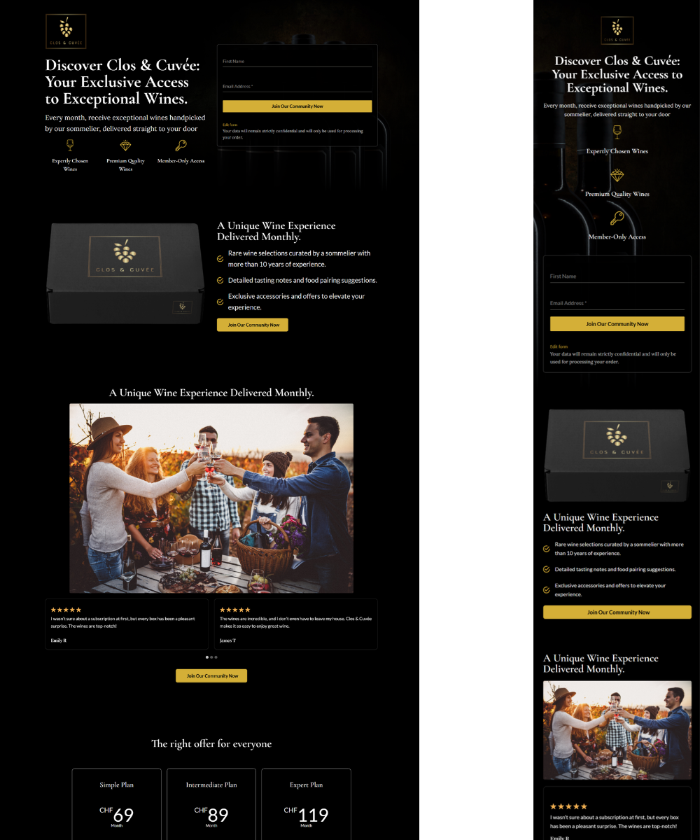
To create a visually captivating, conversion-focused landing page that aligns with the brand’s luxury identity while encouraging user sign-ups and boosting sales.
Solution:
- Brand Design: Developed a minimalist black-and-white aesthetic to reflect the sophistication of Clos & Cuvée.
- Modern Layout: Designed a responsive, user-friendly landing page tailored to premium wine customers.
- Sign-Up Feature: Integrated a sign-up form to capture leads and grow the brand’s email list.
- Conversion Optimization: Strategically placed CTAs for maximum engagement and streamlined navigation.
Outcome:
- Strengthened brand identity with a sleek and professional design.
- Increased lead generation through the sign-up form.
- Boosted user engagement and sales with a conversion-focused layout.
Key Features:
- Minimalist Black-and-White Design.
- Responsive and Mobile-Friendly Layout.
- Integrated Sign-Up Form.
- Strategically Placed CTAs.


